Shiny App -- Covid-19 Viewer
Introduce Covid-19 view
This App is used to monitor global covid-19 cases and deaths, and it can compare the covid-19 cases in different countries.
There are four tabs: Map, Table, Graphs, and `About.
Map: This tab has two leaflet maps. The first one shows the globalcumulative_cases. The second one shows the globalcumulative_deaths. Because the dataset contains huge amount of values, the leaflet maps take much time to run. So, please be patient.Table: This tab shows the latest covid-19new_cases,cumulative_cases,new_deaths, andcumulative_deathsof selected countries. User can select multiple countries to compare them.Graphs: There are one column plot and one line plot in this tab. The column plot help user compare the latestcumulative_casesandcumulative_deathsof selected countries. The line plot tells user thenew_casesandnew_deathsof selected countries. With these two plots, user can understand how successful selected countries control the coronavirus pandemic.About: This tab has short introduction aboutCovid-19 viewerand its creator. It also contains theAcknowledgmentsandReferencessections.
You can download this App from Github.
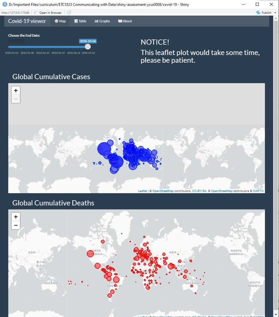
This screenshot is an overview of Covid-19 Viewer.
Self Review
What did I do well
First, this is my first time to do shiny, I did a lot of self study and complete it without any bugs.
Second, it spends me 3 nights to deal with leaflet output for shiny app. During the process, I have trouble to create circle markers within leaflet maps. Thanks Stuart for helping me solve this problem!
What are the points I can improve on?
Loading my leaflet map in the first tab is time-consuming. Every time a user change the slide bar, it would take at least 10 seconds to show the results.
After completion of my About tab, I know a better way to write texts/paragraphs in shiny.
What are some things that I’d like to add that’s plausible?
First, I want to make the line plot in Graph tab animated. The animated plot would look more entertaining.
Second, I want to make users be able to upload csv file in a tab called “Upload file”; after uploading the csv file, the App will draw maps and plots based on the latest dataset. This function can release the app maintainer from updating the covid-19 dataset every day.
What are some things that I’d like to add that cannot be done yet due to limitation in data or technology?
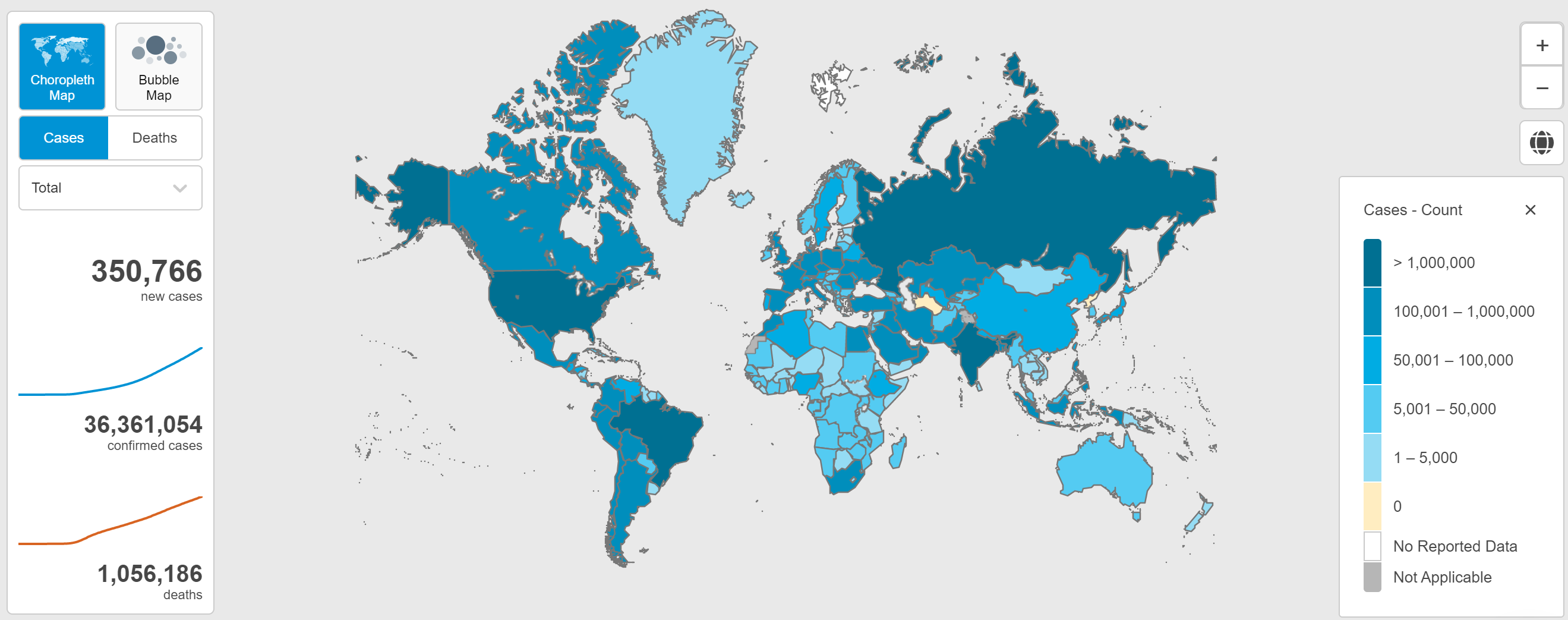
In my plan, the leaflet map will look like the plot below, this plot is from WHO Coronavirus Disease (COVID-19) Dashboard. But after several-days tries, I still could not figure it out.
I also plan to make it available for users to upload csv files by themselves. But after two days, I still cannot solve it.